* 본 포스트는 개인연구/학습 기록 용도로 작성되고 있습니다.
[Python] 버블차트로 모델 성능 표현하기
By MK on January 1, 2019
모델의 성과를 비교하고 싶을 때 버블차트를 이용해보면 좋다.
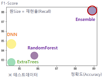
최종 output 활용 이미지는 다음과 같다.
1. 데이터 가져오기
모델 성능을 미리 csv파일로 작성해두었다.
models = pd.read_csv("./datas/model_result_pivot.csv")
아래와 같은 포맷이다. (샘플)
| dataset | model | accuracy | recall | precision | f1_score | auc |
|---|---|---|---|---|---|---|
| train | dnn | 96.488965 | 96.675265 | 96.316391 | 96.495494 | 96.744319 |
| train | random forest | 92.791631 | 93.350530 | 92.318594 | 92.831694 | 96.744319 |
| train | extra trees | 90.427056 | 89.567211 | 91.134442 | 90.344030 | 96.744319 |
이제 필요한 데이터만 추출해오자~! train이나 test 기준을 선택한다.
target_data = models[models.dataset == 'test']
2. 버블 색상 지정
색상은 아래와 같이 임의로 지정하였다. 모델수와 일치하게 셋팅되어야 한다.
colors = ['#afcd38', '#00e8d8', '#909abe', '#9b6191']
3. 라벨 표시하기
라벨을 지정해서 가독성을 향상시키자.
순서에 유의해야 한다.
users =['dnn', 'random forest', 'extra trees', 'ensemble']
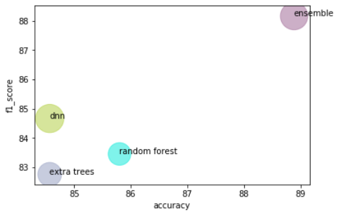
4. 버블차트 그리기
# x,y,size 데이터 셋팅
x = target_data.accuracy
y =  target_data.f1_score
s = target_data.recall

df = pd.DataFrame(dict(accuracy=x, f1_score=y, users=users, s=(s-50)*30, c=colors )) # size 크기는 값에 다라 조정

# 그래프 그리기
ax = df.plot.scatter(x='accuracy', y='f1_score', s=df.s, c= df.c,  alpha=0.5)
for i, txt in enumerate(users):
    ax.annotate(txt, (df.accuracy.iat[i],df.f1_score.iat[i]))
plt.show()
Full code
import matplotlib.pyplot as plt
import pandas as pd

# 데이터 읽어오기
models = pd.read_csv("./datas/model_result_pivot.csv")
target_data = models[models.dataset == 'test']

# x,y,size 데이터 셋팅
x = target_data.accuracy
y =  target_data.f1_score
s = target_data.recall

# 라벨셋팅(순서유의)
users =['dnn', 'random forest', 'extra trees', 'ensemble']

# 컬러셋팅
colors = ['#afcd38', '#00e8d8', '#909abe', '#9b6191']
df = pd.DataFrame(dict(accuracy=x, f1_score=y, users=users, s=(s-50)*30, c=colors )) # size 크기는 값에 다라 조정

# 그래프 그리기
ax = df.plot.scatter(x='accuracy', y='f1_score', s=df.s, c= df.c,  alpha=0.5)
for i, txt in enumerate(users):
    ax.annotate(txt, (df.accuracy.iat[i],df.f1_score.iat[i]))
plt.show()